
Fall is not just a season. It’s a feeling. When you knit the first sweater, pull out the blankets, slip a couple of apples into your coat pocket, and step out onto the front porch… just to breathe. And that’s when the porch becomes the place where home begins.
In this article, I’ve gathered 10 cozy and practical porch ideas that can transform even the simplest entry into a space you want to spend more time. We’ll talk about mums on the steps, color palettes, and how to arrange it all not by “rules,” but by heart.
No complicated DIY, no plastic clutter, no “let’s do it like everyone else.” Only real porch decorating ideas we’ve tested ourselves — from our own home.
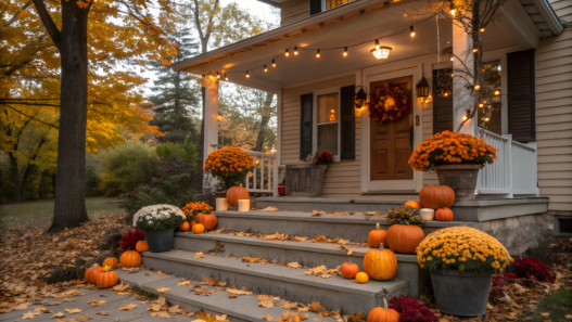
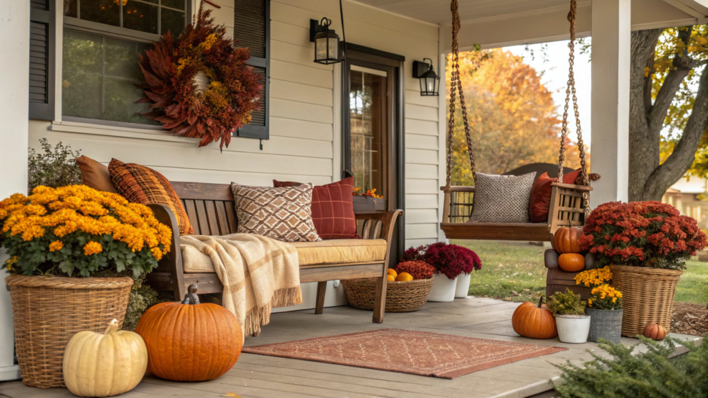
1. How to Arrange Mums on Front Porch Steps
Fall without mums? Not even up for debate. These hardy fall flowers set the mood instantly. But just lining pots along the steps is like hanging a garland and never turning on the lights. It exists, but it has no soul.
Here’s how we style them on our porch — cozy, practical, and unique.
1. The number of steps defines the composition
The more steps you have, the more chances to play with color, form, and height. But even three steps are no excuse to just put down three identical pots.
- If there are three steps — use pots of similar size (around eight inches or twenty centimeters) but in different shades. This creates a soft visual rhythm.
- If there are five or more steps — mix it up. Add crates, baskets, or lanterns. More levels create depth and dimension and make the porch look styled, not random.
We love ceramic planters with a matte concrete finish. They’re sturdy, weather-resistant, and instantly look upscale.
2. Mums aren’t only yellow
Yellow mums are a bit overdone, don’t you think? Fall color palettes don’t have to be one shade. We prefer mixing different but complementary tones.
Our favorites:
- Burgundy with cream and a touch of greenery
- Pumpkin orange with plum and a white accent
White mums are often underrated, but they add a fresh note to the whole arrangement.
The key rule — don’t place two flowers of the same color side by side. Better to play with visual balance: burgundy on the bottom left can be repeated on the top right.
3. Add height for a layered look
The simplest way to make any composition look more thoughtful is to play with height. Put a pot on a wooden crate, a woven basket, or an upside-down bucket. This creates layering and makes even ordinary mums look like the centerpiece.
4. Mix pots with intention
Identical pots are convenient. But like identical furniture, they look dull. To make the porch feel alive and cozy, either use different shapes in the same material, or the same shape in different materials.
For example:
- Only metal pots, but in varied sizes and textures
- Only round shapes, but made of terracotta, ceramic, and wicker
Last year we combined white ceramic planters with galvanized buckets. It looked warm and inviting, especially with blankets and lanterns added.
5. The top sets the tone
Place the largest mums on the top step. They act as the anchor of the composition. Medium pots go in the middle, and at the base you can add pumpkins, ornamental cabbage, or candle holders.
And if you want symmetry, make it not mirror-perfect but “slightly off.” This feels more natural. On our porch, for example, two mums stand on one side and one on the other — but raised on a crate. Everyone loves it.
Tip. Don’t repot mums into decorative planters. Just slide the plastic pot inside. That way, if it gets cold, you can lift the whole pot and bring it indoors. No replanting, no stress. We’ve done this for years — especially with mums on the lower steps, where the wind always hits harder.
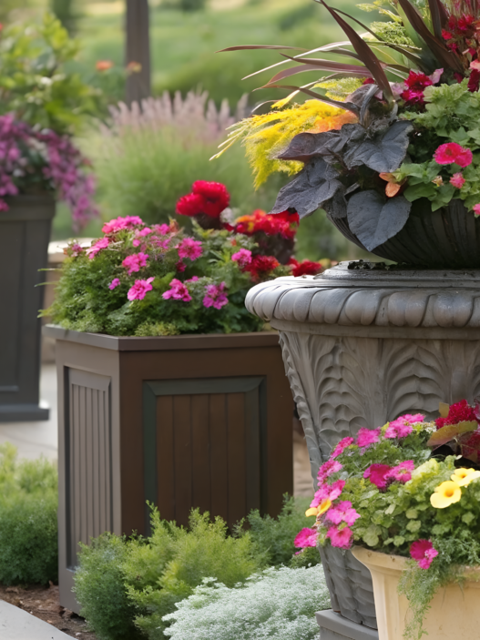
2. Choosing Fall Color Palettes for Porch Decor
Color is the first thing you feel, even if you don’t realize it. The palette sets the atmosphere. Does the porch feel warm? Stylish?
In this section we’ll go over how to choose colors for fall porch decor so everything looks not just seasonal, but truly cozy and balanced.
1. Start with the porch material
Don’t start with the pumpkin — start with what the pumpkin is standing on. Literally.
- Gray concrete — works best with deep, saturated tones: dark green, burgundy, bronze.
- Light wood — softer muted shades fit: ochre, sage, cream.
- Red brick — pairs well with creamy, white, and pumpkin orange accents.
The color palette shouldn’t fight the background, but complement it.
2. No more than three main colors
This rule saves you from visual noise. The best combo is:
- Two base colors
- One accent (bright or unexpected)
Examples:
- Warm burgundy with cream and rose gold
- Olive with pumpkin and matte white
- Chocolate with linen and brass
Important! One of the colors should be neutral — it holds the whole composition together.
3. Use repetition
If you pick, say, sage green — repeat it in at least three elements:
- On the doormat by the door
- In the pillow pattern
- In the ribbon on the wreath
This creates a sense of intention, even if the decor was thrown together after work.
4. Textiles can set the palette
When there’s no time to plan colors, I just take one textile item I like and build the fall color scheme around it.
For example, last year we bought this throw — White Plaid Fall Throw Blanket by DII. It had warm gray-orange and a bit of burgundy. We added pumpkins and candles in the same tones, and everything looked complete.
5. Skip the neon
Neon orange or bright lilac accents might sound “fall,” but in reality they often look cheap. Especially paired with plastic planters.
If you want freshness — add matte white or cream. They calm the composition. If you want boldness — choose mustard, rusty red, or deep navy instead of neon yellow.
6. Add metal — but softly
Fall palettes pair beautifully with warm metals. For example:
- Brass or copper lanterns
- Galvanized buckets
- Wrought iron stands
One of my favorite pieces that works every time — Stonebriar Antique Copper Metal Lanterns. They add shine, depth, and a touch of hygge.
7. Play with light: candles and lanterns
Neutral colors reveal themselves best with soft lighting. That’s why lanterns and candleholders aren’t just decorative — they’re a full part of the palette.
- Yellow flame emphasizes warm tones
- White LED lights make colors cleaner and sharper
- Twinkle lights add charm… but only if they’re not blue
The chosen fall color palette should be cozy, slightly muted, with bright details. And most of all — it should be one you want to return to again and again.
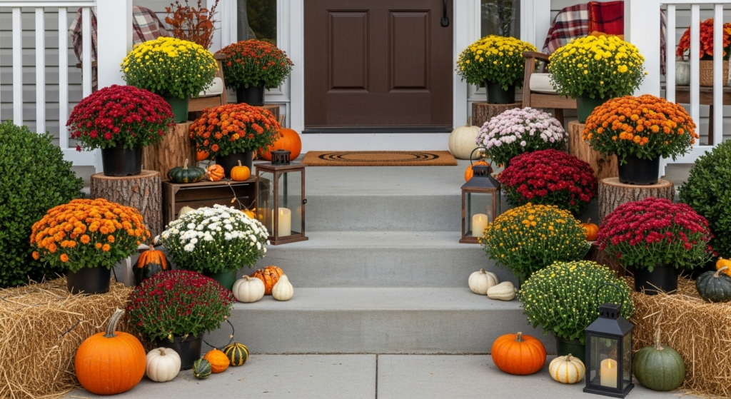
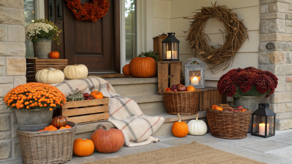
3. Mixing Natural Elements Like Hay and Gourds
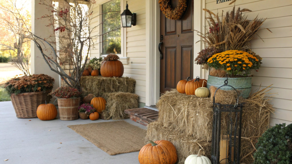
It’s the natural materials that turn simple porch styling into a truly atmospheric space. No plastic leaves, no glittery fake baskets.
Here’s how to combine hay, pumpkins, branches, dried flowers, grasses, and moss so it feels alive — not like a supermarket display before Halloween.
1. Start with a base of hay or straw
Hay sets the structure and levels. We use it as a stand for pumpkins, flowers, and lanterns. It creates that “temporary coziness” — like a little farmers’ market corner on your porch.
Always pick bales, not loose hay. They’re stable, don’t scatter in the wind, and last the whole season. We had one bale hold up for two months by the door, through several rains and even a goat’s attempt to eat it. And it survived.
2. Use pumpkins as accents, not just “pumpkins”
Pumpkins are visual markers. They set accents, support the palette, and add texture.
Ways to combine them:
- White and beige — with gray planters, under copper lanterns
- Dark green — next to burgundy mums
- Classic orange — on hay bales or under a tree
The best look comes from natural, matte varieties — like Fairytale Pumpkins, Jarrahdale, or Cinderella. We usually buy some at a local farm, but sometimes order artificial ones so they don’t rot. For example, the Winemana Artificial Harvest Pumpkins Set looks real, especially with a bit of real hay sprinkled around.
3. Grasses and branches set the outline
If hay is the “base,” and pumpkins are the “volume,” then branches and grasses are the outline and vertical lines. They add height, move in the wind, and bring life to the arrangement.
What works:
- Willow or birch twigs — for structure
- Maple branches with leaves still on — for color
- Dried wheat or oats — for texture
These can go in buckets, baskets, or tied with twine. We often use Kohros Natural Wheat Bundles for Fall Decor. Once dry, they last until the end of November.
4. Don’t forget moss and wood chips
They fill gaps, finish the look, and protect from dirt. Moss works perfectly:
- In planters (around flower pots)
- Between pumpkins
- In woven baskets with dried flowers
SuperMoss Reindeer Moss looks natural, feels slightly moist to the touch, and doesn’t fade.
5. Arrange by zones, not by items
One common mistake is placing everything separately: one pumpkin here, one lantern there, hay somewhere else. It’s better to build zones. For example:
- Left side of the steps: a large arrangement of hay, two pumpkins, and dried grass
- Right side: a basket with branches and a planter with mums
- By the door: lantern + wreath + one mini bale
That way it looks like a complete fall porch scene, not just random decor items.
Hay is the structure. Pumpkins are the accents. Branches and dried flowers bring atmosphere. Moss ties it all together. And together, they create a cozy porch composition you can feel before you even open the door.
4. Using Lanterns and Candles to Add Evening Ambiance
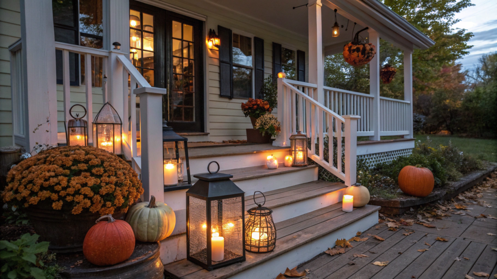
Light transforms the fall porch into a true extension of the home, even when the wind is chilly and dusk comes early.
Let’s break down how to use candles, lanterns, and subtle lighting to add atmosphere. No harsh illumination, no chaotic strings of lights — just warm, soft, and “breathing” glow.
1. Choose warm light, not cold
Start with the most important detail: in fall, the temperature of light matters. Anything white or bluish belongs back in the holiday storage box.
Look for these labels on packaging:
- 2000K–2700K — warm candle glow
- 3000K — soft warm light, like a bedroom lamp
- 5000K and above — cold office lighting (not for the porch!)
If you’re using electric candles, choose ones with a flickering flame effect. For example, the Homemory Outdoor Waterproof Flickering Flameless Candles. We place them inside lanterns — no one can tell they’re not real, and the batteries only need changing once a season.
2. Use lanterns as architecture
Lanterns are structure — form, volume, vertical lines. We often place them:
- On both sides of the door
- On the steps next to mums
- On wooden crates or hay bales
- Inside woven baskets, lighting up dried grasses
Metal lanterns with clear glass work best. For example, Stonebriar Antique Copper Lanterns — perfect height, warm patina, and a wide handle (so they can hang if you have a hook).
Tip.If you place several lanterns together, mix sizes. One tall, one medium, one small. This creates depth and a natural, “lived-in” look.
3. Add candles into flower and pumpkin arrangements
Small tealights or LED versions fit right into fall decor:
- Between pumpkins
- In a wreath by the door
- In a basket with pinecones and branches
- Inside a clear jar with moss
4. Don’t overdo it: less is better
Remember, lighting is an accent, not a show. Don’t flood the front porch like a parking lot. Just enough:
- One large lantern by the door
- A couple of small ones on the steps
- A few candles tucked into the arrangement
If you add string lights, keep them simple — wire with micro-bulbs on batteries. Best hidden in a wreath or wrapped around a crate.
5. Light and texture
Light shouldn’t just shine — it should highlight textures: rustic metal, woven baskets, velvet pumpkins, soft moss.
- Aim a lantern at branches — they cast beautiful shadows
- Place a candle in a planter with grasses — it creates a silhouette
- Light a wreath from inside — details come alive
Warm light doesn’t demand effort — it demands attention. Arrange lanterns so they don’t just illuminate the way, but invite you to pause. To sit. To feel the evening.
5. DIY Door Wreaths That Match Your Front Porch Theme
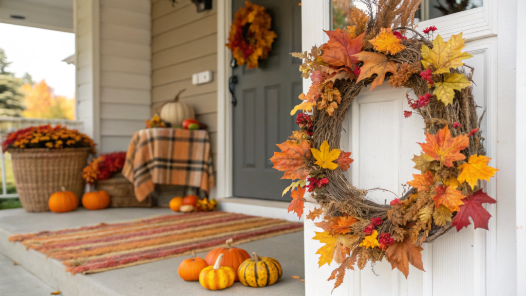
A wreath is an essential part of your fall front porch. It’s the first thing to greet guests, and it should blend naturally with the rest of your setup: pumpkins, blankets, mums, and the color palette. Let’s break down how to make a fall wreath yourself so it supports your porch theme. No overcomplicating, no overload. Just texture, color, shape, and a little inspiration.
1. Define your front porch style — and follow it
Here’s a quick guide:
- Warm farmhouse/rustic: straw, burlap, dried grasses, wood slices
- Neutral classic: eucalyptus, dried flowers, white berries, a touch of gold
- Boho: cotton, macrame, feathers, matte pumpkins
- Traditional fall: maple leaves, orange foliage, mini pumpkins, berries
The door wreath should be like a miniature version of the theme — supporting the same colors, materials, and mood.
2. Base frame — simple and sturdy
My favorite option is a grapevine wreath frame. It’s sturdy, natural, doesn’t need to be fully covered, and already looks beautiful on its own.
Here’s the one I bought this year — Darice Grapevine Wreath, 18 inch. Perfect size, lightweight, no chemical smell.
Alternative: a metal frame wrapped with sisal, burlap, or yarn — closer to a boho look.
3. Materials: less plastic, more texture
Wreath ingredients can be very simple:
- Dried grasses (oats, wheat, ryegrass)
- Mini pumpkins (real or fabric)
- Pinecones, walnuts, acorn branches
- Leaves (real or fabric)
- Burlap, linen, cotton
- Large wooden beads or lace
From faux pieces, a good option is the CEWOR Artificial Fall Maple Leaves and Berries Set.
4. Attach — don’t glue
Anything hot-glued will need to be torn off later. That’s why I always use wire, twine, or floral clips. This is especially handy if you want to refresh the wreath in a month — just remove the leaves and add cedar branches for December.
5. Center is the accent, sides are support
The wreath composition works best when:
- The boldest element (like a fabric pumpkin) is placed at the bottom left or right
- Leaves, branches, and berries spread upward and outward
- The top of the wreath is lighter and airier
- The color palette matches the fall front porch decor around your steps and door
This year we made a wreath with fabric mini pumpkins, burlap, and wheat stalks. Then we added a piece of lace from an old pillowcase on one side. It instantly transformed the look!
6. Ribbon — the finishing touch
A ribbon isn’t always necessary. But if you want one, choose a natural texture: linen, jute, or raw cotton. Hanging it on simple twine often works even better than a bow.
I usually buy the Natural Jute Ribbon Set — it comes with three widths, no shine, no synthetic look.
Quick tip. If you’re not confident, just repeat your front porch palette in a smaller version: the same leaves, the same burlap, the same tones. The wreath instantly becomes a logical extension of your overall fall composition.
6. Elevating Your Front Porch Look with Cozy Blankets
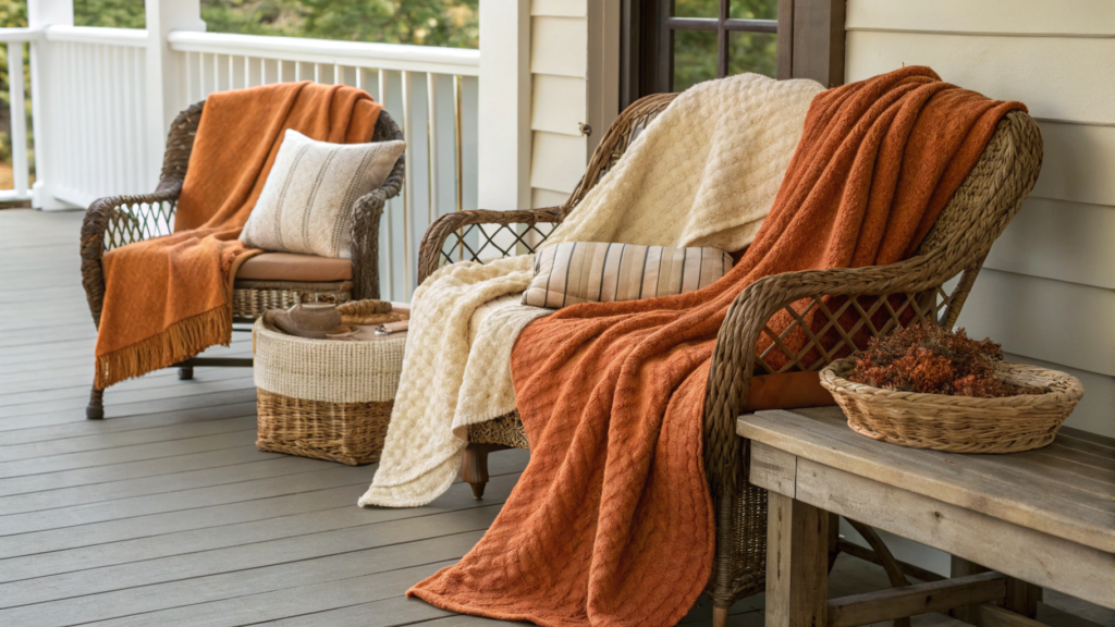
To make the front porch truly cozy, it’s important to know how to use textiles — especially fall blankets.
Let’s look at how throws can transform the mood of your front porch, which ones to choose, where to place them, and how to secure them so they don’t end up on the neighbor’s fence with the first gust of wind.
1. Texture first, color second
In fall decor, it’s not just about color coordination (though that matters too), but the feel of the materials. A throw shouldn’t just look pretty — it should feel like part of your life.
What works best:
- Chunky knit throws — instantly give a sense of homey comfort
- Fringed throws — add movement, especially in the wind
- Wool, fleece, tweed — hold their shape and don’t look “flat”
2. Where to place them
Throws can be used in many ways:
- On a chair or bench — folded in half, one side draped down
- In a basket by the door — add a pillow inside and place a pumpkin on top
- On a wooden crate — as a textile tablecloth under a lantern or flower pot
- Hung on a hook or ladder — works as a backdrop
Important! If you place a throw near outdoor mums, choose one that’s machine washable. These can handle real life — dust, leaves, dampness — not just a Pinterest picture.
3. Colors: repeat, don’t copy
Good blanket colors for fall:
- Warm gray
- Deep burgundy
- Olive
- Mustard
- Natural cream or beige
Pick shades one or two tones darker than your main decor. This creates depth instead of blending into the background.
We once tried a pure white throw — it ended up looking like a bathroom towel. Better to stick with muted colors and solid textures.
4. Always secure them
Fall means wind. Especially if, like us, you live in an open area. A throw left loose will eventually end up on the stairs or in a tree.
Ways to secure:
- Tie with twine to a chair armrest
- Use tablecloth clips — especially if the throw is on a crate
- Place a heavy lantern or pillow on top
- Or simply tuck the edge between chair slats and backrest
We do this every fall, and it’s not only practical — it adds to the lived-in feel, as if someone already sat here with a book.
5. One blanket — one cozy spot
No need to scatter throws everywhere. One, maybe two, in key spots is enough. They should draw the eye and make you want to sit and wrap up.
Better one quality throw than five shiny polyester ones. We like neutral options such as the Bourina Textured Soft Knit Throw Blanket. It looks high-end but costs under $30.
A throw blanket isn’t just warmth — it’s a visual invitation. It shows that this is a place to relax, to stay a little longer. Even when it’s truly fall outside.
7. Making a Statement with a Bold Front Doormat

You can line up a dozen mums, carefully arrange pumpkins, hang a handmade wreath, and even light it all with warm lanterns… but if the front doormat is boring or off-theme, all that effort is wasted. Seriously. The doormat is the anchor of the whole front porch setup — it either ties everything together or… well, you’ve seen those sad “Welcome” mats that sat through three years of rain.
Let’s look at how to choose a bold, stylish doormat that works for you: visually, functionally, and emotionally.
1. The right size is already half the wow factor
The most common mistake? A doormat that’s too small. It visually shrinks the entry, especially if you’ve styled the front porch with a wide door, flowers on the sides, and layered decor.
Remember:
- For a standard 36-inch (91 cm) door, the minimum doormat size is 24×36 inches (61×91 cm).
- The best option is a mat as wide as the door plus six to eight inches (15–20 cm) on each side.
2. Text should work — or not be there at all
“Hello,” “Welcome,” “Bless This Mess” — none of this reads as heartfelt anymore. It’s like a T-shirt that says “Happiness.” Okay, but sterile.
If you go for text, it should:
- Reflect your mood
- Be witty or have character
- Or match the palette and theme
Examples:
- “Hey Pumpkin” — for a pumpkin theme
- “Hope You Brought Pie” — if you really do have pie inside
- “Homebody Club” — like ours, because we rarely leave the front porch
If you don’t want words, choose geometry, plaid, stripes, or natural textured materials. These “speak” visually instead of verbally.
3. Layer under the mat — the trick almost no one uses
If you want your doormat to look Pinterest-ready, just add a fabric mat underneath. Best choices:
- Jute
- Buffalo plaid (white and black, beige and brown, etc.)
It creates a frame, a visual podium for the mat. Plus, it helps with moisture and makes the entry stand out.
4. Material — natural with firm bristles
The most durable doormats are: coir, jute, or ribbed rubber. The key is:
- The mat keeps dirt outside
- Easy to clean
- Not slippery after rain
Synthetic mats fade fast, especially under direct sun. But a coir mat — even faded — looks authentic, like leather that only gets better with age.
5. Switch mats with the seasons — it’s normal
One doormat for the whole year is convenient, but dull. In fall, pick one with character. In winter, swap for an evergreen theme and spring, something light and fresh.
Let the front doormat be the first sign of a mood change — like a banner on a website, only at your home.
A doormat isn’t just “something underfoot.” It can be fun, stylish, and practical. The main thing is not to lose sight of it in your overall front porch decor.
8. Combining Different Pot Sizes for Mum Displays
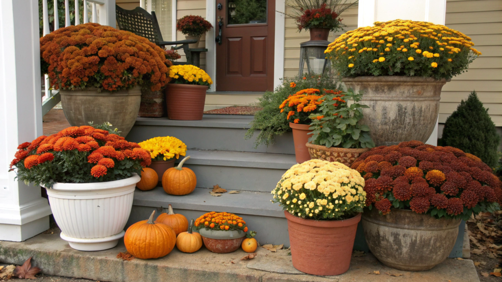
Mums are the ultimate fall accent. And pots of different sizes, shapes, and heights, arranged with intention, can turn a simple front porch into a styled fall scene.
So how do you mix pot sizes so they work together as a whole? Let’s break it down.
1. Different sizes — but not random
It’s a mistake to think “different” means anything goes. To make the display look lively but not chaotic, use the principle of visual rhythm:
- One large accent pot, about twelve to fourteen inches (30–35 cm) in diameter
- One medium pot, about ten inches (25 cm)
- One or two small pots, six to eight inches (15–20 cm)
This combination — one large, one medium, and two small — creates a sense of balance.
2. Work with a triangle layout
Those design “triangles” they teach in composition classes work here too:
- Place the tallest pot in the back and slightly off to the side
- Put the medium one forward, but not centered
- Nestle the small ones between them as connectors
This adds depth. The scene won’t look flat, and even without lanterns or pumpkins it will still feel like a full fall accent.
3. Keep a common thread, not identical pieces
The pots don’t need to match exactly — that’s boring. But they also shouldn’t look like they came from different worlds. Combine around one unifying detail, such as:
- Color palette: shades of gray, beige, earthy tones
- Texture: only matte, only concrete-style, or only woven
- Material: metal and ceramic, as long as both are muted
These Classic Home and Garden Terracotta Planters Set work beautifully in different sizes.
4. Add height with stands and crates
If you don’t have a tall pot, you can make one. Just raise a medium pot on:
- A wooden crate
- A metal stand
- A hay bale
- An upside-down bucket covered with fabric
This year, we put a pot on a flipped woven basket with fabric, and it looked more expensive than the ceramic one we saw for eighty dollars.
5. Flowers inside: repeat rhythm, not color
Different pot sizes don’t mean every mum color has to be different. In fact, a single color palette across multiple levels looks professional. For example:
- All pots with cream mums
- The largest accented with dried grasses
- Small ones framed with moss and pumpkins
A mix of three different colors in different sized pots often creates a noisy look. Better to play with color repetition than with mismatched variety.
6. Group them, don’t spread them around
The most striking look isn’t symmetry on either side of the door, but grouping in one corner. For example:
- One large and one medium pot by the steps
- One small pot on a crate
- One pot on a hay bale
- And between them, a lantern or a wood sign
This corner setup draws the eye and creates a complete composition.
7. Use the natural height of the plants
Not all mums are the same. Some grow tall, others are rounded and wide. Use this to your advantage:
- Tall-growing mums in the tallest pot
- A full, rounded ball in the medium pot
- A small shrub or accent plant (like moss or grass) in the smallest pot
Don’t be afraid to mix pot sizes. Shift them, test them, rebuild them. You’re not just placing pots — you’re shaping the fall mood of your front porch.
9. Adding Height Using Decorative Stools and Crates
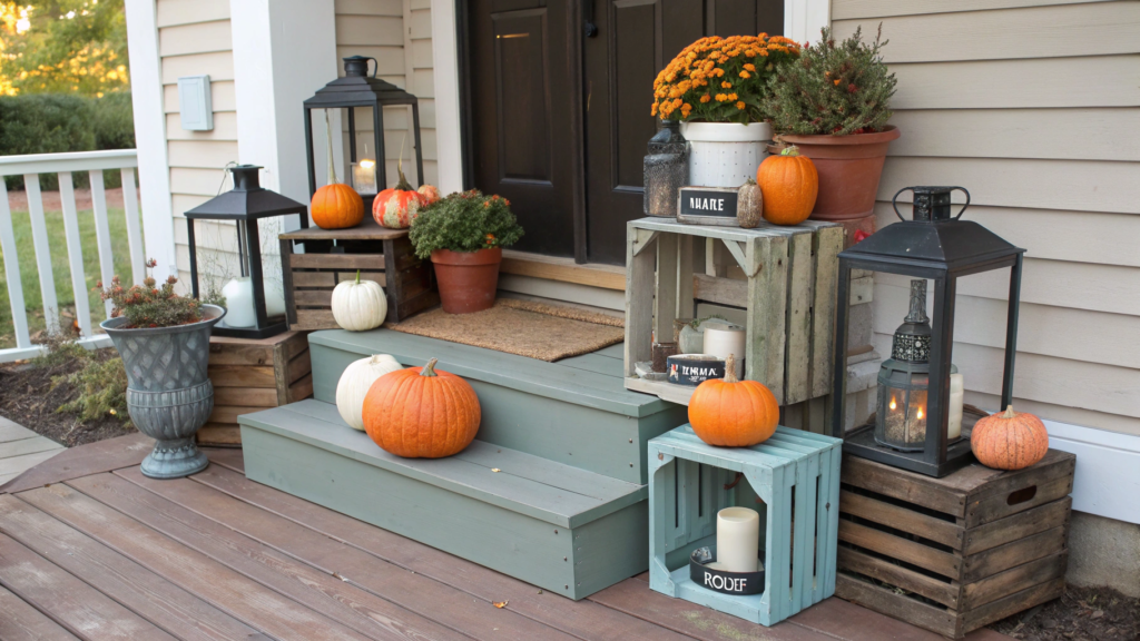
Height is what makes decor feel complete. When all the pots, lanterns, and pumpkins sit at the same level, the scene looks flat — especially in photos. But once you start playing with height using crates, stands, and stools, the front porch suddenly becomes layered and alive.
1. Wooden crates: affordable, natural, always works
Old wooden crates are my go-to every season. They:
- Provide stable support for pots and pumpkins
- Add rustic texture
- Can be used vertically or horizontally
- Stack inside each other for off-season storage
We use the Ikee Design Wood Crates Set of 3 — they look weathered but are strong, and don’t wobble even under a heavy planter.
How to use them:
- The largest works as a low bench for two pumpkins
- The medium stands upright under a pot with mums
- The small goes in a corner with a lantern and dried grasses
2. Stools and plant stands: mix materials
If you want a modern touch, use stools or stands made of metal, rattan, woven wicker, or ceramic. This works especially well if your porch isn’t rustic but more neutral or minimalist.
A Plant Stand Set that raises planters six to twelve inches (15–30 cm) adds a vertical accent and fits any style.
Best placements:
- In the front porch corner to pull the eye upward
- On both sides of the door to support large mums
- Next to a bench or basket for balanced height
3. Use hay bales as stands (and decor)
If you’re thinking, “I already use hay,” perfect. Just start using it as a tier too.
For example:
- Place a mum in a ceramic pot on the bale
- Add a small pumpkin or lantern beside it
- Put tall branches in a metal bucket behind it
This isn’t just hay anymore — it’s a podium. One bale held two planters and a metal pumpkin for us all October, and it looked better than any shelving unit.
4. The key is alternating high and low
Here’s an easy way to visually layer the front porch:
- Top tier: a tall mum on a stand
- Middle tier: a lantern or basket on the floor
- Bottom tier: pumpkins, moss, decorative cabbage
This creates rhythm. The eye travels through the scene like steps on a staircase. Equal height always loses — even if the items are beautiful, without layers the decor doesn’t “grab.”
5. Combine open and closed surfaces
Crates can be:
- Used as a shelf — pot on top, blanket or candle inside
- Turned to the wall — serving as a podium
- Placed on the side — filled with a garland or branches
Stools and stands work best as anchors — place heavy or bright pieces on them. Crates create “stages” for smaller scenes.
6. Never forget stability
Whatever you set up, it has to be secure. Especially on an open porch with wind, kids, or pets.
- Stands should have rubber feet
- Crates should sit on a flat surface or be leveled with a shim
- Never place heavy items on woven baskets — they bend
Tiers are the secret to a professional look. No need for expensive shelving units, no need for symmetry. A couple of crates, a stable stand, and your imagination are enough to make the porch look styled and say a lot about the people living in the house.
10. Strategically Placing Fall Decor for Front Porch Balanced Symmetry
Symmetry is not always balance, and balance is not always symmetry. Especially in fall decor, where we have pumpkins, mums, lanterns, blankets, wreaths, baskets, and crates. Everything is beautiful, but everything is different.
Let’s place fall decor wisely so the whole scene feels complete, interesting, and still lets you walk through the door with ease.
1. Start with your porch architecture
The first step is to look at your porch like a designer. Where is the door? Are there steps? Railings? A bench? A wreath hook? These are not obstacles, they are the framework.
Basic scenarios:
- Centered door with a wide porch → symmetry works, but not mirror symmetry. Let elements on each side be different in size but equal in visual weight.
- Offset door → build diagonally: a large piece on one side (like a pot and crate), lighter accents on the other.
- Narrow porch → go vertical. Use stands, hanging baskets, a wreath, or a tall hay bale.
2. Balance is about weight, not shape
Visual weight is how strongly an item attracts the eye. It depends on:
- Size
- Color (bright reads as heavier)
- Texture (dense or glossy feels heavier)
- Height (tall pieces feel heavier, especially on the edges)
So if one side has a dark metal lantern and the other side has a light basket with leaves, they do not balance each other. Better: lantern plus grasses on the left, and on the right a large wreath plus a small bench with a blanket.
3. Build with a Z or L layout
Z layout (for a spacious porch):
- A large accent at the bottom left
- A medium piece in the center
- A small accent top right (like a wreath or hanging basket)
L layout (for narrower or asymmetrical porches):
- Concentrate decor in one corner, left or right of the door
- At the base: a crate with a lantern and pumpkin
- On top: a pot of mums
- Beside it: a basket or blanket
- Above it all: a wreath or hanging accent
This gives direction to the eye — from large to small, top to bottom, or the reverse.
4. Use pairs, but mix within them
It’s pleasing when two pieces frame the doorway, but let them differ in type while being equal in strength.
For example:
- Right side: wrought iron lantern plus basket with grasses
- Left side: mum planter plus blanket on a wooden bench
Mix forms freely as long as the height and visual weight align.
5. Leave space open
Do not put a pumpkin on every single step. Empty areas make the setup look richer. Better three strong, intentional groupings than eight random items.
We usually stage:
- One corner at the steps
- The space by the door
- A small “oasis” farther off, maybe by a railing
Between them — air, silence, simplicity. That is what gives the eye rest.
6. Test for convenience
Remember, you use this porch. So:
- Do not place tall pots in the middle of the stairs
- Put blankets where you can actually grab and sit with them
- Keep open-flame lanterns away from fabric
- Place the doormat where it is visible and does not block the door
We always do a final check by walking across the porch as if for the first time. Anything inconvenient shows itself immediately.
7. Lighting as a balancing touch
If lanterns stand on both sides of the door, perfect. But if you only have one, it is fine. Just balance it with a strong piece opposite — a wreath, a hanging basket, or a tall grass pot.
Light adds equilibrium. In the dark, it is light that defines strength and weight in the scene.
Balanced porch styling is not measured by a ruler. It is about feelings. About how the eye travels, what you want to touch, and where you want to sit. That balance comes not from repetition, but from intention.
Cozy porch
When a porch feels alive — even with just two pots and a lantern on a hay bale — it becomes more than decor. It shows that someone shaped the space with attention. That this is not just a house where people live, but a home where someone notices the shifting light, the cooler mornings, the way the air smells different.
I often think fall coziness is not about warm things. It’s about being willing to be part of this season.
If you feel the same way, leave me a comment. I’d love to hear how your home is welcoming fall this year.